
Recently I was in the process of making myself a top from one of my patterns, the "Peggy" blouse, and I arrived at a decision point about color choices.

I decided to ask folks in my favorite (non-paganoono) Facebook group, the Up-cycled Cloth Collective, for input.
I started with these two photos and the question was: which band to use, blue or red? The feedback seemed almost evenly mixed, with great comments:
In the Red Camp:


"Red, to pick up the red from the cherries/berries."
"I like the red better...otherwise the berry fabric isn't tied in to the rest of the design."
"Red, it lifts it and contrasts with the red in the flowers."
"Red is livelier, blue more conservative. I prefer the red."
"Red. There's enough blue already."
"I like the red best as it gives a contrast. I think with the blue band, the red bits in the cotton look a bit out of place."
"Red, or else the white background fabric will look out of place."
"Definitely red!! The contrast is very striking."
In the Blue Camp:
"Blue...doesn't interrupt the flow of the piece and would be more slenderizing."
"I think the blue because the red seems to cut the design in two. Jmo."
"Blue, that way the fruit stands out better"
"Blue! The cherries and apples pop more with the blue. Besides, you can always change it later."
"The red chops it in half drawing the eye to the horizontal red mark while the blue accents it but keeps it vertical."
"I think blue - the red is nice, but it emphasizes the horizontal and makes it look "chopped." Good work!"
"I love blue, it gives the blouse a delicate look."
"The great thing is that they all work so it really doesn't matter which you choose.
My personal favorite is this one. It's hard to describe why. When I flip through the pictures my mind relaxes when I come to this one? I think if you do it with this band and the vertical striped band between the two panels it will be perfect."
And some with creative suggestions:
"I'd say all red. I looked at picture 1 first and barely noticed the blue. Alternatively, make all the trims, make them detachable like belts, and just change to whatever you feel like on the days you wear it. There! That's a total compromise answer, isn't it?"
(I have been known to change things out later, even when they were sewn in.)
(I have been known to change things out later, even when they were sewn in.)
"Blue and put the red on the opposite cuff to the coloured panel to balance the design."
 "...change the buttons to red ones or alternate the threads of the buttons for red and blue thread." (love the button suggestion)
"If blue, then add a red embellishment near shoulder, if red, add red to the collar."
"My preference is the red with a bit of a red accent on the top half."
"Half and half ... blue on cherries side, red on the blue side. Plus I like someone's comment above to change to red buttons - sweet!"
"I love both and I suppose it very much depends on you. Red looks more for warmer months whereas the blue looks warm and cozy for winter."
"Blue, maybe you have some red buttons the same size, could imagine that this would look lovely"
"Put white instead of blue or red."
"Maybe add a touch of the red or the cherry print as a faux handkerchief in the breast pocket?"
"Never trust a committee to make an aesthetic decision." (LOL)
At this point I could see both perspectives. I like bold pieces, and did want to bring the red out to the rest of the garment. I liked the half and half suggestion, so added two more choices:
 Some of the resulting comments:"Half and half, blue on the floral side, red on the blue!"Blue or red but not both together. There's enough mix going on. So one or the other. Very cute!!!!"Half and half last option, it completes the colour blocking.""Very cute; I don't know because I like every pic!!! Depends on the day, I guess!!""No half and half go blue""fully red, not half and half. Sets off the division nicely.""I am starting to like this one more and more (1/2 split, red on left)... The striped band down the center better bridges the two lower front panels.""Red trim with blue bottom & blue trim with red."
The folks who commented directly on each photo overwhelmingly selected the last one, 1/2 blue, 1/2 red with the red above the blue. That happened to be my preference as well, although I thought more balance was needed on the top half of the garment and a red accent might really help. I liked the suggestion of a faux hankie in red. P.S. The strawberry/apple print is a vintage tablecloth (stains and all).I use real hankies every day and have some red ones, so might not need a faux hankie. My other thought was to use a favorite accent of mine, added circles, either appliqued or reverse appliqued.Here is the final version with red buttons. In the same group I posed the question: added circle(s) or not? One or three circles? 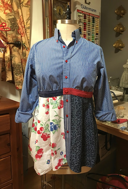


:

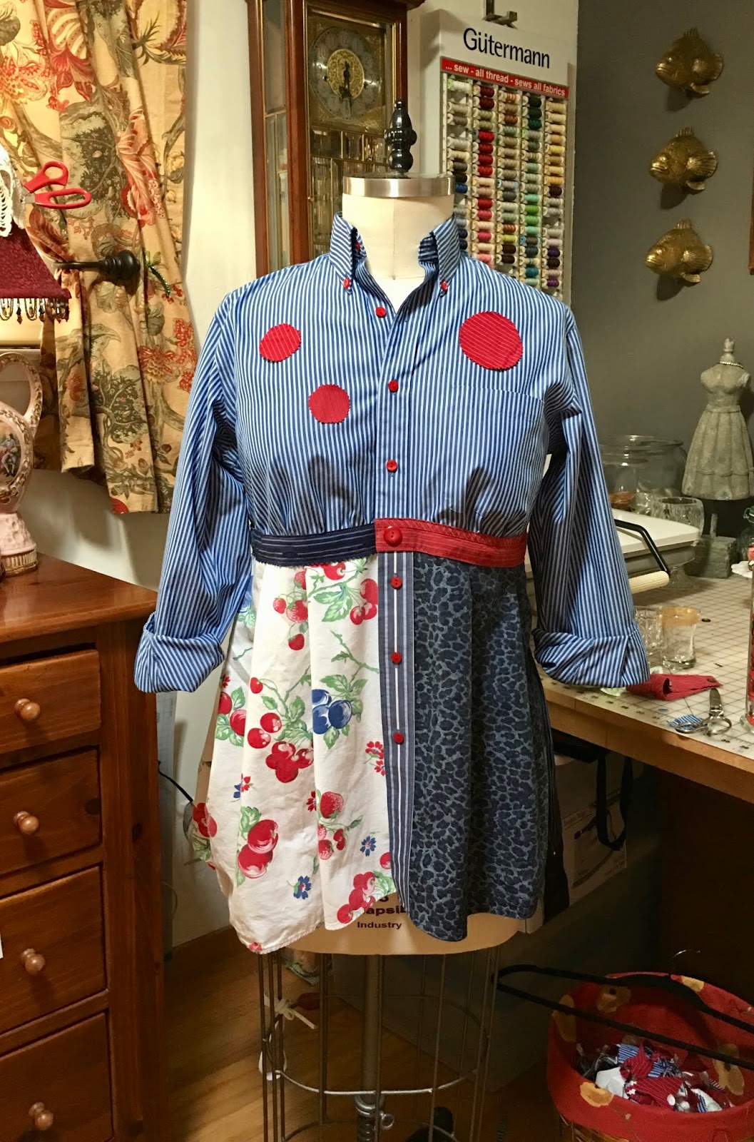
More great feedback: If in doubt - leave it out. NoneBeautiful! I vote for 1 accent circle as shown in the second pic. It balances the light color of the bottom right of the blouse.I would add either three or none: having just the one looks like some kind of badge.None. Optional flower pin perhaps?None. A red flower as suggested above.I like the red buttons.Now it's perfect. No circles Love the red buttons. No - to the dot(s) - but just a bit of red with green flower/pin would be a yes ( of course visual would be needed. BTW - I love the community designing projects you are posting - I feel so "artistic"... LOLMy preference would be a small bunch of cherries above the pocket with a leaf. To mirror the opposite side.I love the idea of the circles but from the pictures they read as a solid and to me they are too harsh. I would choose a red and white polka dot, a blue and white grid, and a smaller scale floral for example. I would also move them up a bit closer to the neckline so that the circles create a visual path that runs into the button band.
This is such a cool use of the cherries and other fabrics. I have your pattern but as a plus size it’s hard to find a shirt to start out with. I came up with one I had previously upcycled and am thinking about beginning with it and adding the bottom pieces. I know how to sew but am not good at clothing. We’ll see! Thanks for sharing the process.Too many round images - need something square/rectangleI think I would instead add patch pockets (2 or more!), rather than the dots. Pockets could be of contrasting patterned fabrics in red or blue, or even green (to pick up the green in the cherry fabric). (Which I love, btw! Also, who says pockets have to be square? Semi-circle or even the full dot shapes work, too! (So, you can still use your dots. Extra pockets or no, you could also replace the existing patch pocket on the bodice with a contrasting pocket from another blouse (you could swap the pockets, for a two-fer. Or, you could transplant the swapped-out bodice pocket to the skirt (I favor the "cherries" side for that), which has the added benefit of tying together the patterns from above and below. You could then also add another contrasting patch pocket--perhaps out of the cherry material--to the other side of the skirt (dark blue pattern). One can never have too many pocketses, just ask any Hobbit!I'd go for embroidered cherries or strawberries on the pocket instead!Maybe spray of small cherries on collar - one side? Cute anyway!!I really like this blouse; I think it's my favorite of the ones you've shown us here. But the accent dots aren't doing it for me. However, I think if you make one of your fabric flowers using red (and other leftovers from this project), and use it as a coordinating brooch to wear (or not, as the mood strikes), that might do it. I think the added dimension and texture would be more interesting than plain red dots.Like the red buttons! 3 or none or you make them into broches and can remove/ add them as you like it YES! I mean, I voted for the half and half waist and I like how it turned out. I am not sold on the accent circles because I like how it looks. Maybe on the animal print?Ah ha, so when I said both I was right


If you enjoyed this post and would like more information on choosing color and pattern Click here to be linked to a Paganoonoo video tip. Also find out the one color guaranteed to look great on you!
P.S. To be added to the Paganoonoo mailing list, never sold or shared, and:
- see new example garments,
- get links to additional upcycling video tips,
- hear about sales,
- new patterns and events, please click here
No comments:
Post a Comment